Hello, my name is Matt Freed. I grew up in Indiana, surrounded by corn and soybean fields. In Arizona now, one might say I’ve gone from corn to cactus. Regardless of location, my passion for design and art remains constant.
>>> Scroll to read more of my story.
I used to watch my mom sitting at her wooden desk in the warm summers. With the windows open, and a slight breeze, she would dip her pen into India ink, and I would hear the sharp metal tip scratch against the rough paper.
Over and over, dip and scratch, dip and scratch, for hours until the dark lines formed recognizable shapes. Later after the ink dried, she would go back with loose watercolor strokes to add depth and life to her work. She would frame her art and hang it on our walls.
Those memories are vivid to me, and I knew I wanted to be an artist.
>>> Keep scrolling - lots more to see.

By fifth grade I was well on my way to becoming that artist ;-)

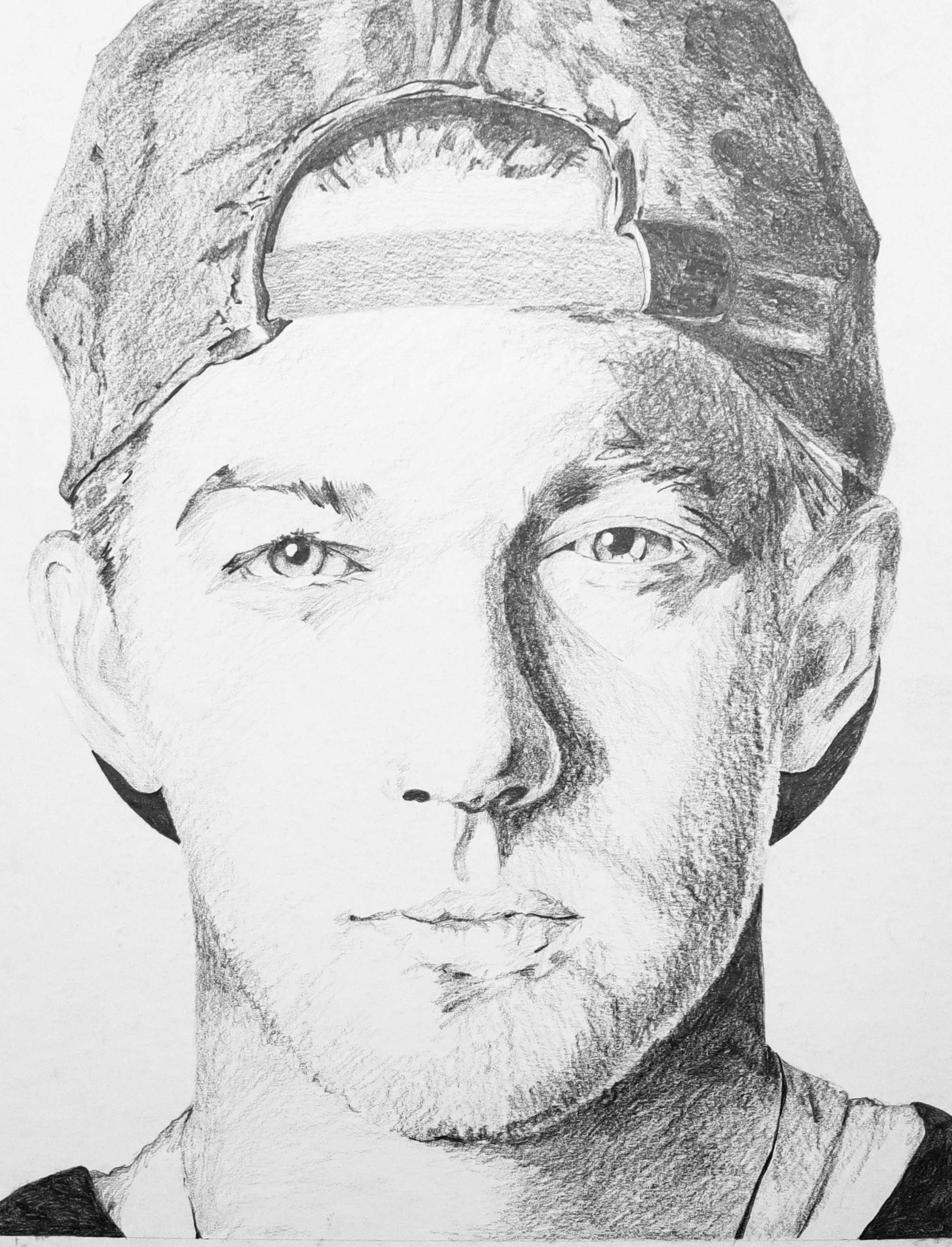
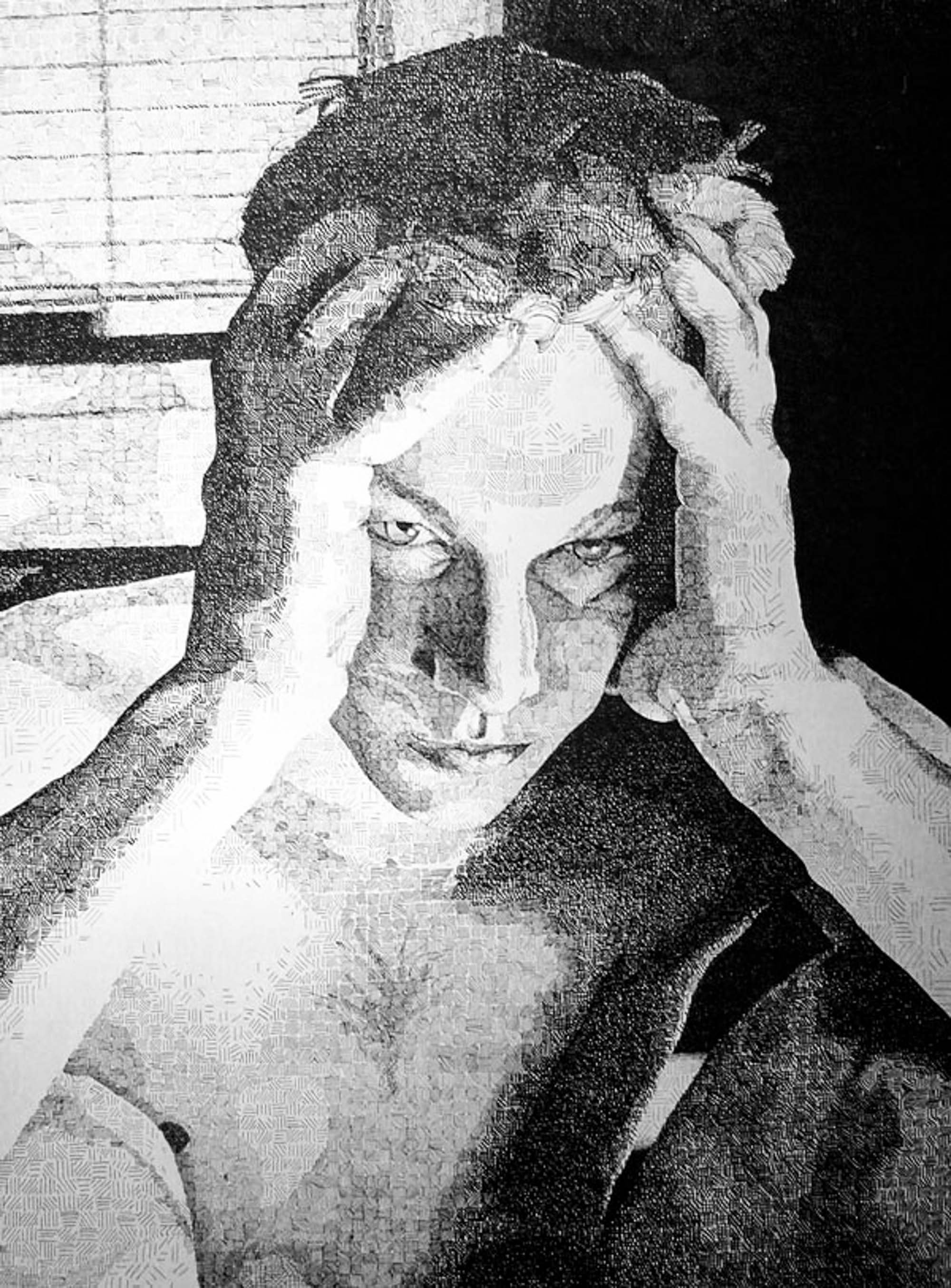
In eighth grade my art teacher, Mr. Rasp, encouraged me to submit this stippling work to a local art contest and I won. As the winner, I got to show my artwork on a local television show and was interviewed. This event changed how I thought about art – art could open doors.
Let’s skip high school – does anyone make good decisions in high school? Not sure I did much better in college .
I was ready to prove myself when I got to college. I knew I wanted to be a graphic designer and needed to pass several art foundations courses to be accepted into the graphic design program.

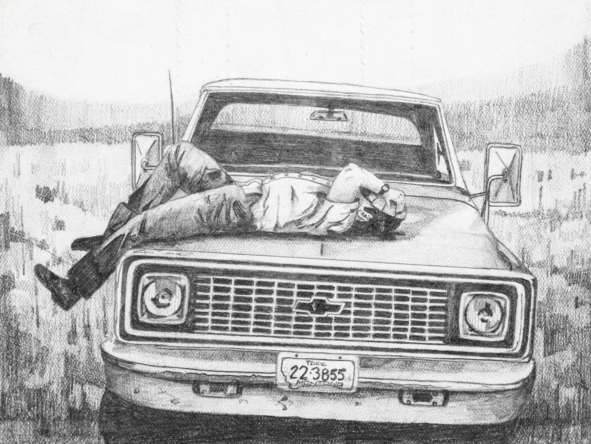
I enjoyed the classes. Art history, design theory, and painting were all amazing, but my favorite was drawing. I loved the control of a pencil to get fine details and a large tonal range.

I left college before I got into the graphic design program, and I went seven years without creating art.
I was on the path to becoming a high school history teacher. Then in 2001, the opportunity to design presented itself.
A small technical college was hiring a graphic designer and I was able to get an interview. Panicked, I had about a week to create a portfolio of work from scratch. I went to that interview with a printed portfolio of all new work designed in PowerPoint. To my surprise, I got the job. I found out later that it was a sympathy interview; they had already hired someone for the job, but after seeing my work the hired me, instead. I spent the first two weeks working with Adobe textbooks in my lap learning software I had never opened.
My goal of being a creator began.
Graphic Design – The Early Years
Before I was refining brand strategies and leading creative teams, I was just a new designer figuring things out—one published piece at a time. These first ads, created more than 20 years ago, were my crash course in kerning, hierarchy, image selection, and sometimes… humility.
Looking back, they’re equal parts cringe-worthy and endearing—a reminder of where I started, how far I’ve come, and that every designer’s journey is built on lessons learned the hard way.
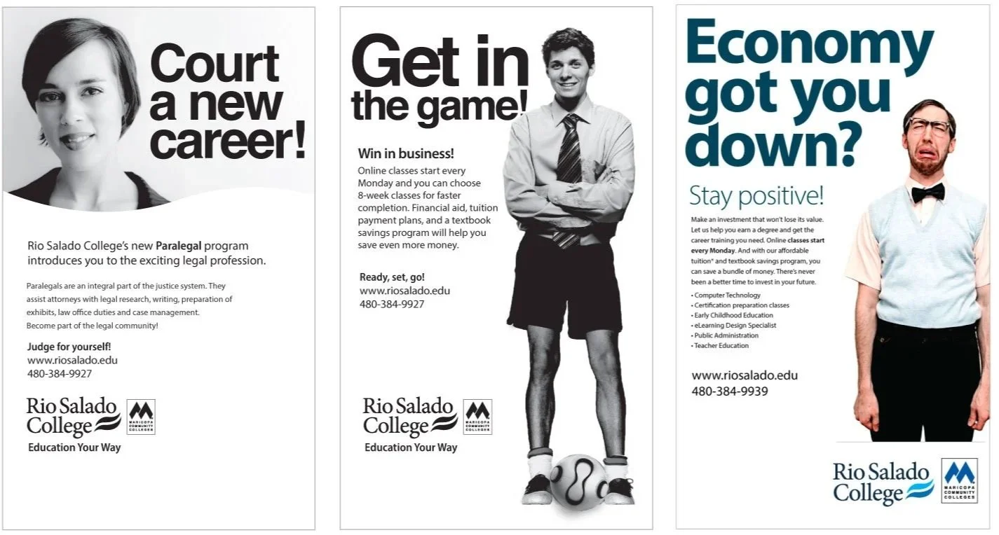
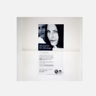
My very first ad to ever see the light of day—over 20 years ago. Let’s just say… it had issues. Kerning? Off. Hierarchy? What hierarchy? Fonts and image choice? Questionable at best.
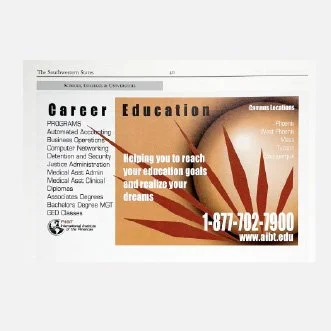
This was my first published piece at Rio Salado College. I still remember the uphill battle to get approval for that close-up shot of the woman—breaking free from the standard “smiling student” template.
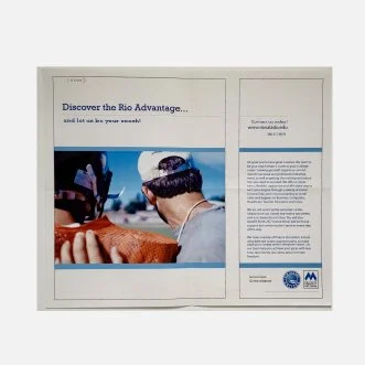
A split spread in a sports edition publication. The layout is clean, the image is strong, and it ties nicely to the theme. There is still work that needs to be done with typography - and the copy… let’s just say less is more.
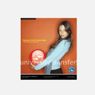
I honestly don’t know how or why this one happened. Sure, it grabs your attention, but beyond that? The reflection on the ball is nice, but the concept—if there was one—is lost on me now. What was I thinking?
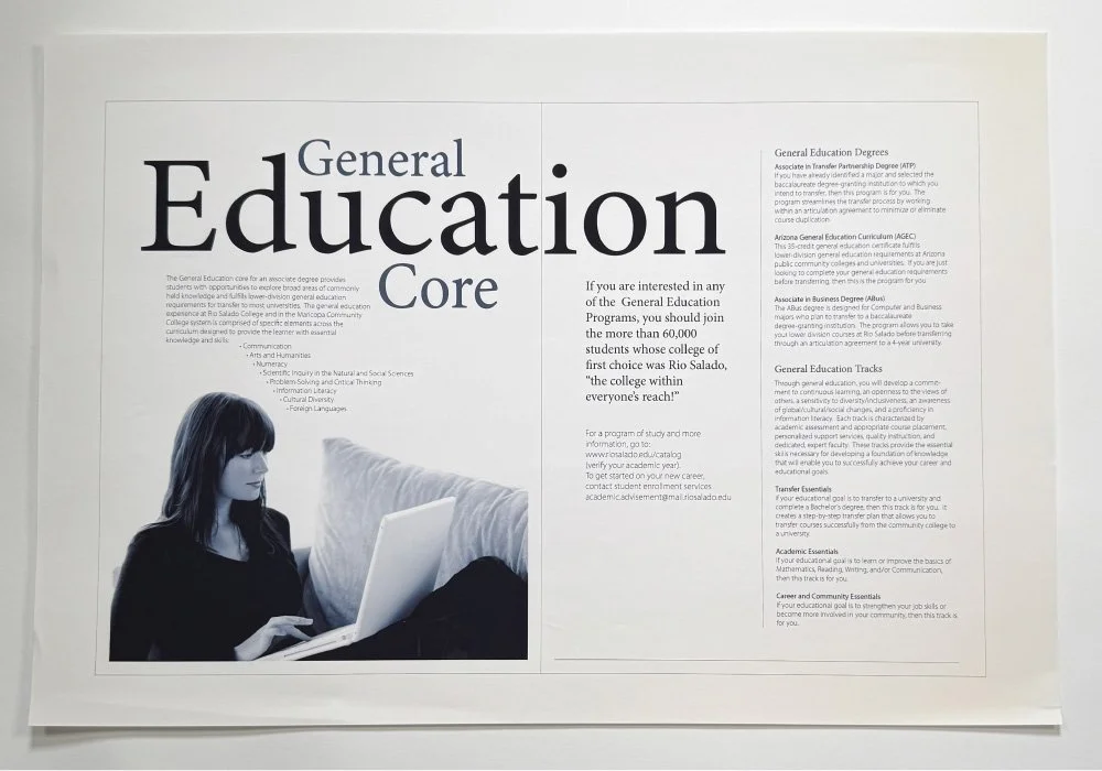
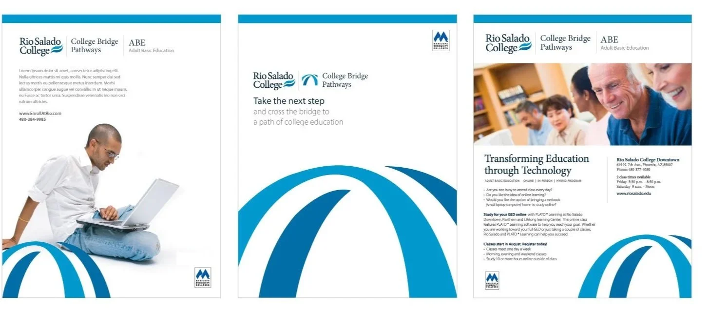
Here’s where things started to turn a corner. My love for typography began to show in these early pieces. This was a large brochure layout for some of our key program areas, and I think the clean design and type still hold up— even after 20 years.
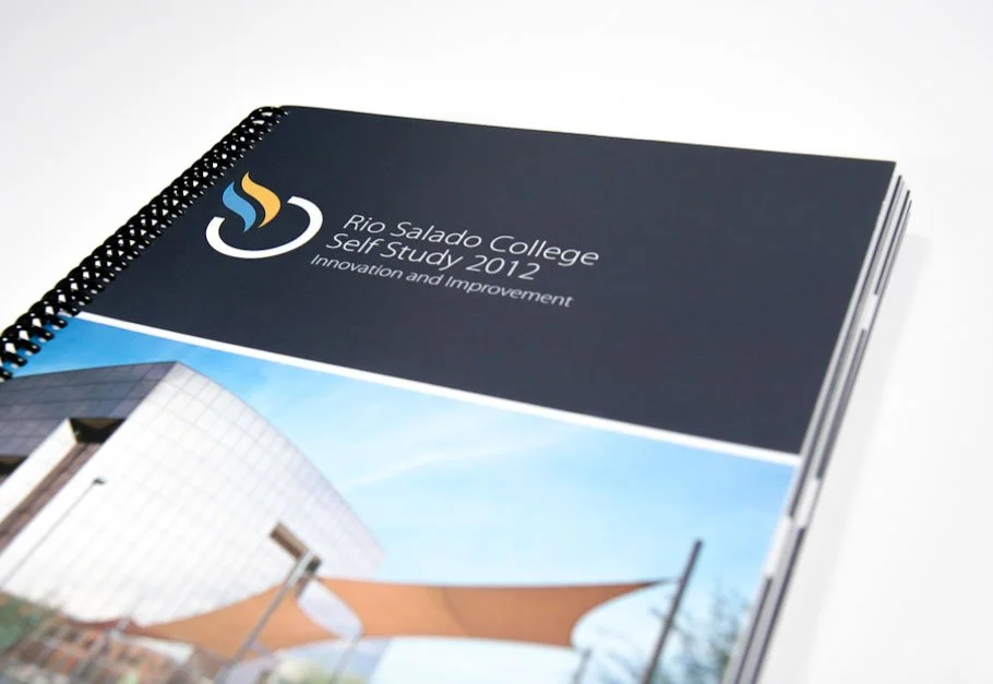
My composition and layout started to get better the more I practiced and executed creative briefs.