Print Smart Email Redesign: Designing with Clarity and Purpose
Before diving in, I want to be clear — this post isn’t a critique of Print Smart as a company. They’re a local printer here in Phoenix doing great things for the community, including their annual Yes to Pets Food Drive. This is simply an exercise in design observation — looking at an email I received, identifying what could be improved, and reimagining it through a more cohesive and intentional lens.
Analyzing the Original Email
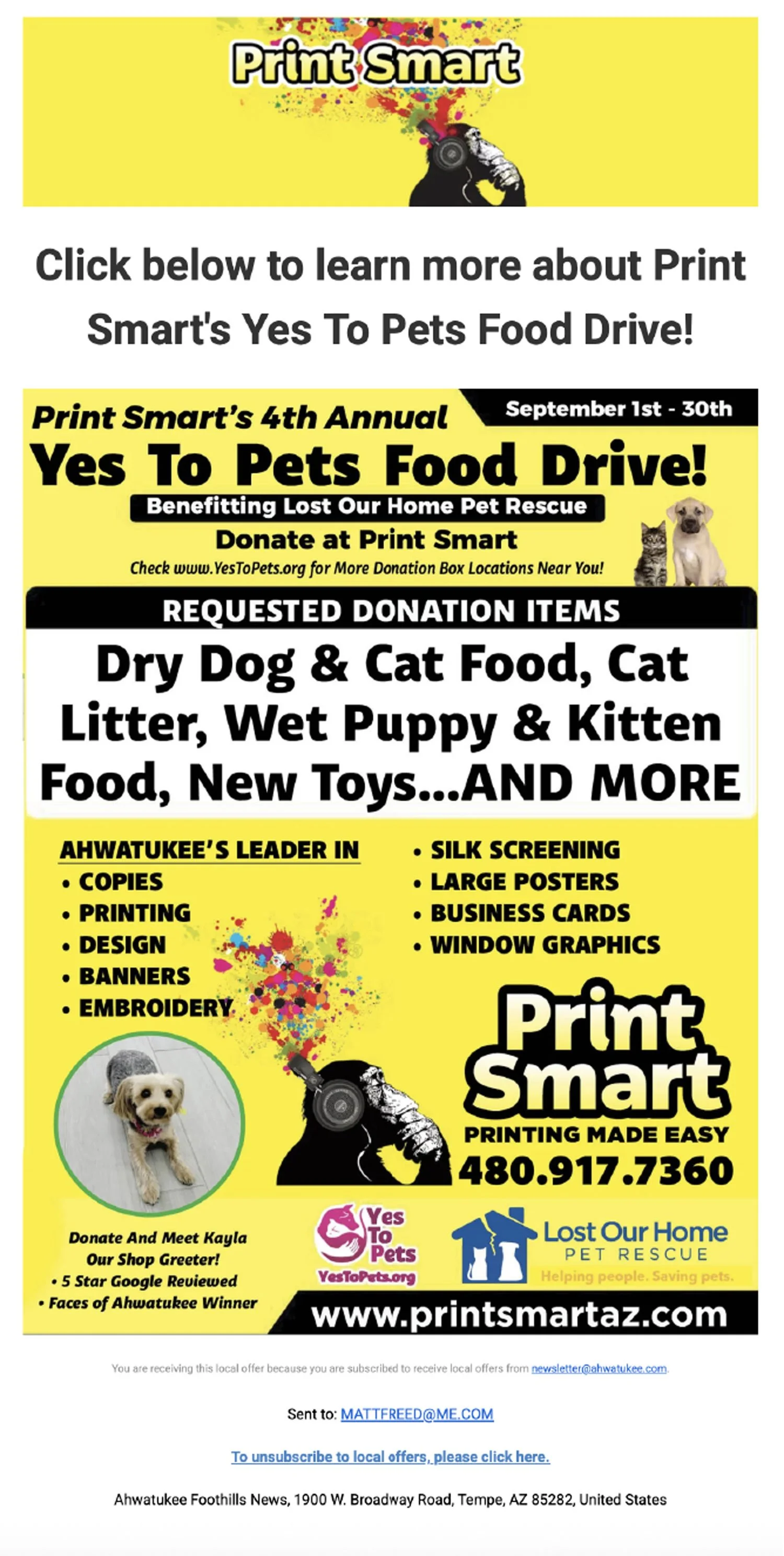
At first glance, the original email has a lot of energy — bold colors, playful imagery, and plenty of information. But that energy also creates visual clutter. Let’s break down a few key areas that could be refined:
Header image: The “Print Smart” logo shares space with a paint-splattered monkey graphic. While fun, it distracts from the brand name and doesn’t directly connect to the email’s purpose — a pet food drive. This top section is prime real estate, and it should clearly communicate the focus of the campaign.
Headline and call to action: The line “Click below to learn more about Print Smart’s Yes to Pets Food Drive” misses the real call to action. The goal isn’t to “learn more” — it’s to donate. Clear, action-oriented language helps guide the reader.
Layout and typography: There’s a mix of centered and left-aligned text, multiple font weights, and tight line spacing, all of which make the email dense and hard to scan. Consistency and spacing are essential for readability and visual harmony.
Content hierarchy: The email combines two distinct messages — the pet drive and general business promotion. Separating those helps each message breathe and ensures the reader knows where to focus.
The Redesign
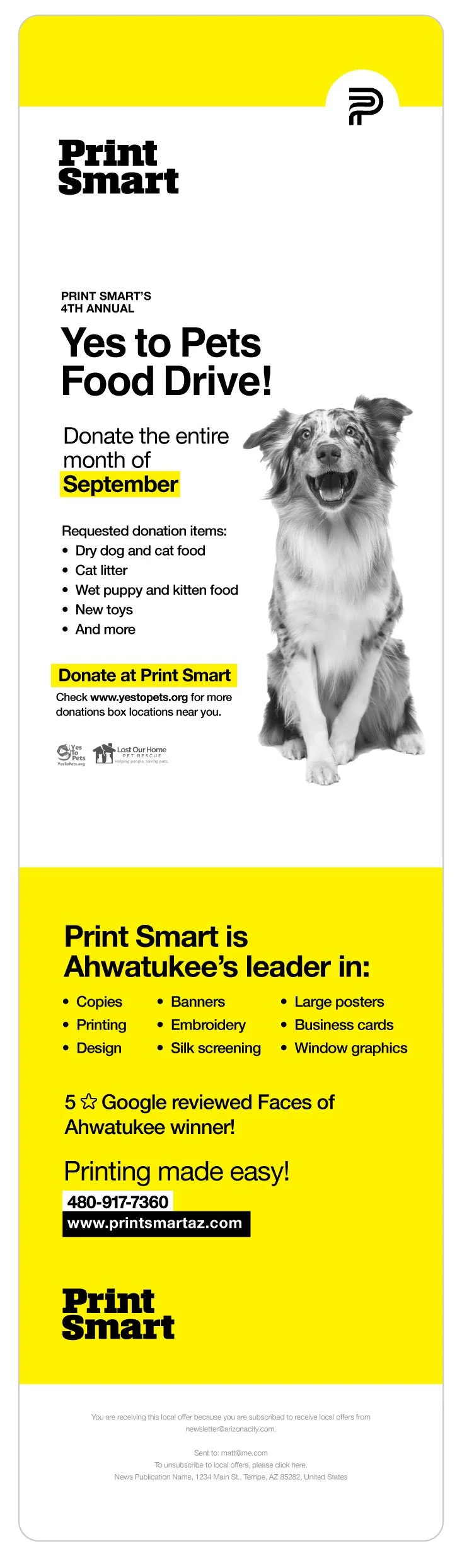
In the redesigned version, simplicity and focus lead the way.
Clean header: The header now features only the Print Smart logo, creating immediate brand recognition without distraction.
Emotional imagery: A large, friendly dog image anchors the design, drawing attention and setting a compassionate tone that connects to the pet drive theme.
Clear hierarchy: The main headline, “Yes to Pets Food Drive,” takes center stage, supported by a clear timeline (“Donate the entire month of September”) and an unmistakable call to action (“Donate at Print Smart”).
Unified typography: Using a single typeface with just two weights keeps things consistent and readable. Color is used intentionally — not for decoration, but to create contrast and emphasis.
Whitespace and flow: Generous spacing and clear sections make the email easy to read. The pet drive content stands apart from the business promotion, each with its own background color for distinction.
Subtle details: Rounded corners and soft background tones make the email feel friendlier and more approachable — fitting for both the subject matter and the community-focused brand.
The Takeaway
Design isn’t just about making something look better; it’s about making communication clearer. By simplifying the layout, establishing hierarchy, and creating emotional connection through imagery, the redesigned Print Smart email tells a more focused story: