Land O’Lakes Butter Package Redesign
I didn’t set out to fix anything. Land O’Lakes already refreshed their packaging in 2020, and I think it works. The rebrand was by CBX and they have a nice case study about the butter rebrand. But sometimes, as a designer, the urge to make something just sneaks in (and it was in my fridge). That’s what this was: not a critique, not a pitch—just me wanting to roll up my sleeves and see what my version might look like.
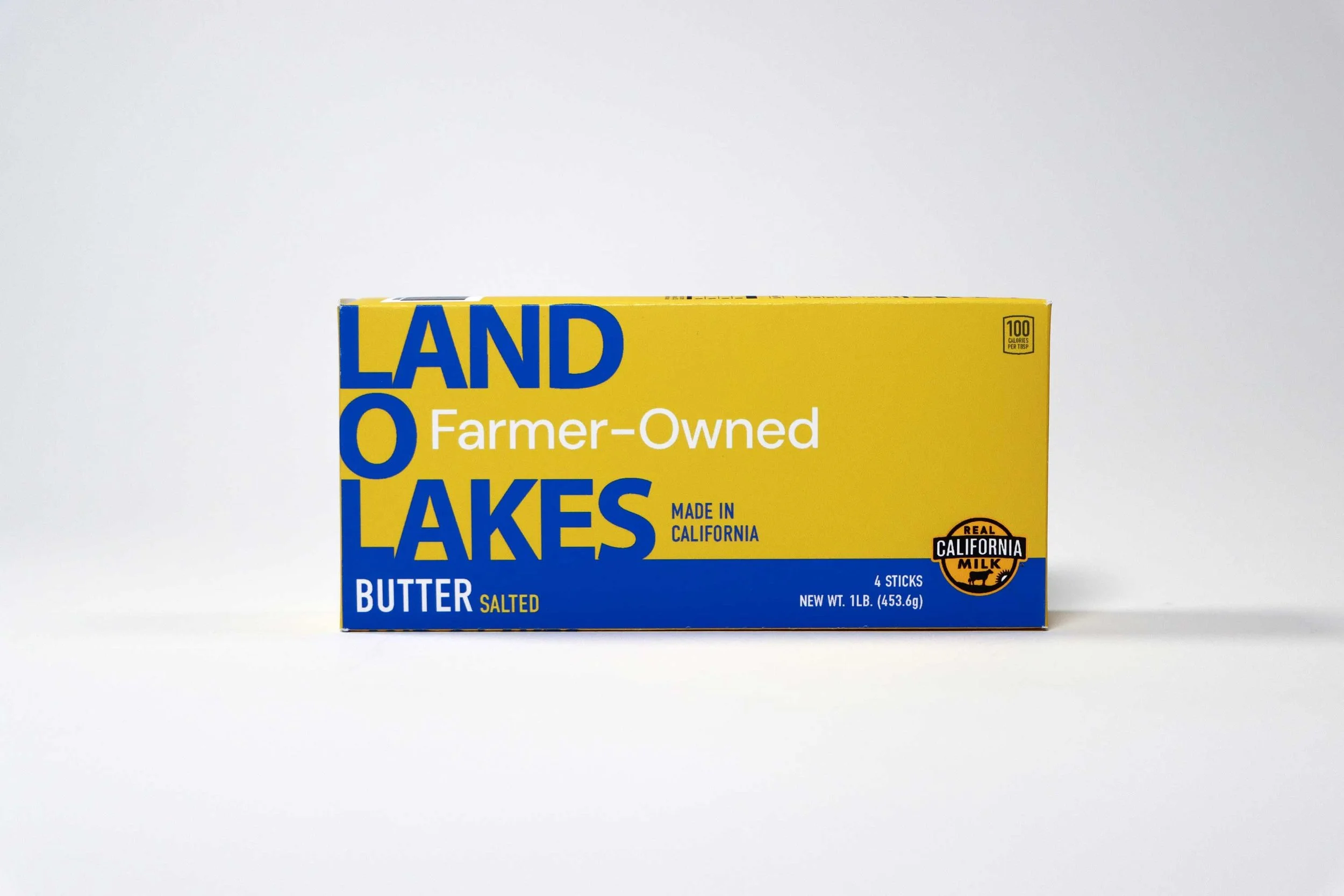
When I started, I asked myself: what could I strip away? What story could I tell if I reduced the noise? That led me to three choices:
Simplify the type
Remove the scene
Highlight “Farmer-Owned”

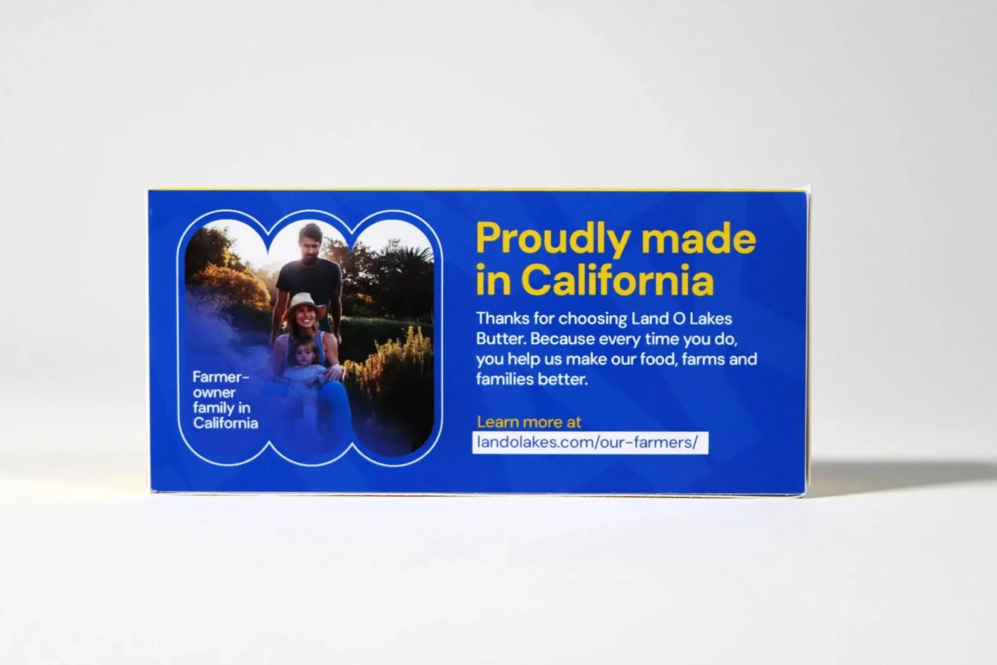

The result feels bold, pared-down, and confident. It’s not trying to be flashy—it’s direct, with the cooperative story front and center.
More than anything, this was an exercise in making. So much of my career has been about leading strategy, managing teams, and overseeing campaigns. Redesigning a butter box? That was just me, one-on-one with type, space, and story. And it reminded me how much I enjoy creating for the sake of it.
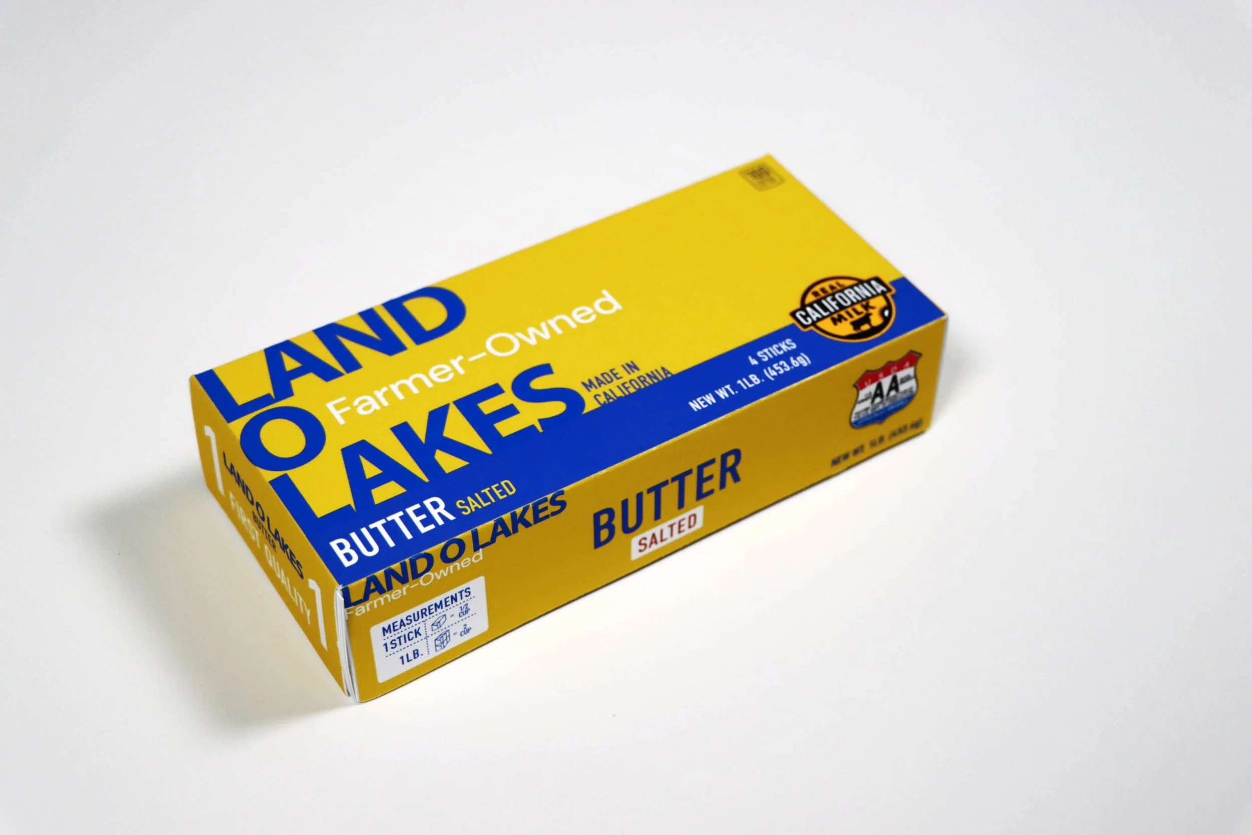
Current Land O' Lakes packaging
