ART DIRECTION | GRAPHIC DESIGN
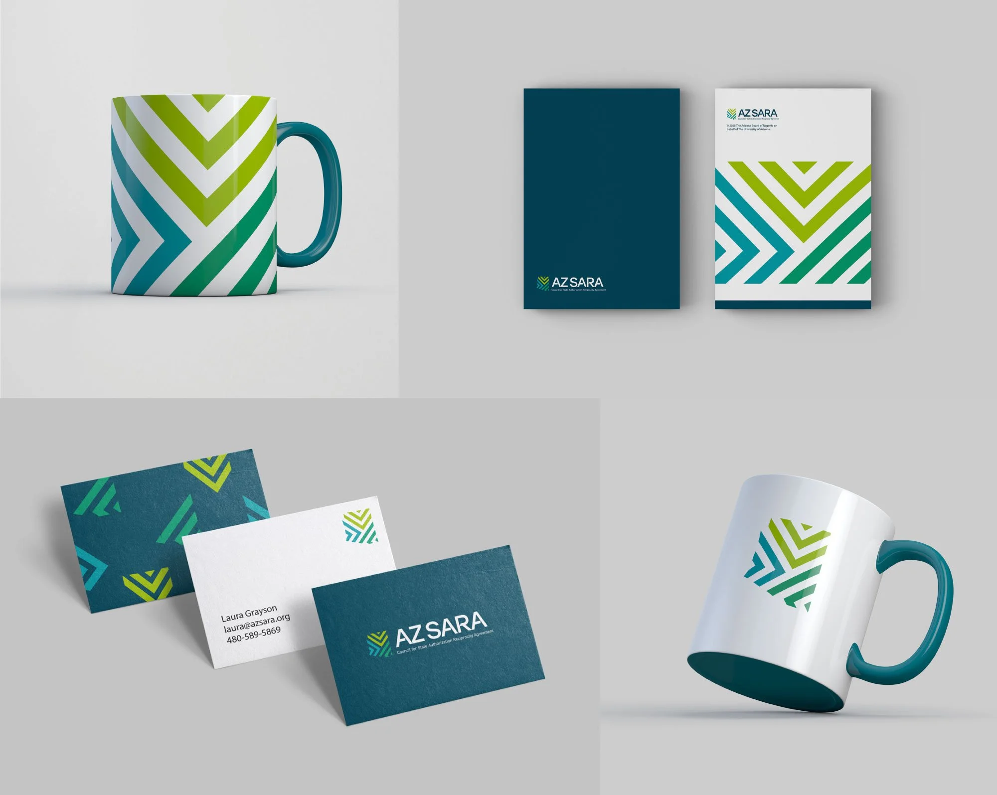
AZ SARA’s executive leadership sought a brand identity that moved beyond typical Arizona imagery—eschewing state flags and colors—in favor of something more progressive.

SARA is an agreement between institutions, states and higher education regional compacts for the delivery of distance education across state borders.
Beyond Borders: Building a Progressive Brand for AZ SARA
Role
Designer and Art Direction
Education
Industry
Define a brand that reflects the mission, values, and collaborative spirit of Arizona’s approach to the State Authorization Reciprocity Agreement while staying true to the state’s history and culture.
Challenge
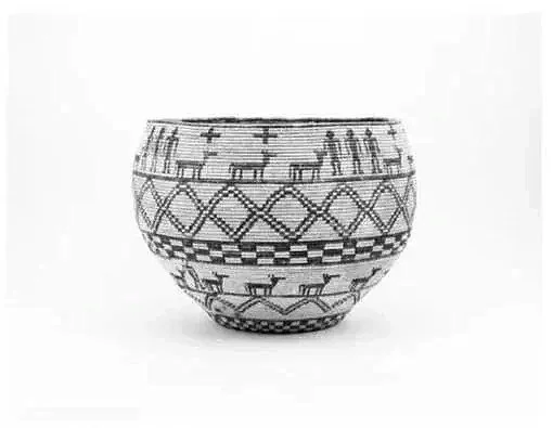
The brand’s visual language draws meaning from the landscape and heritage of the state. Triangular forms reference Native American symbolism, grounding the identity in the region’s rich cultural traditions. Arrows convey advancement and forward movement, while repeated and merging lines represent the collective effort of three distinct sectors—working together under one model to ensure consistency, efficiency, and quality in postsecondary distance education.
Solution


Brand Philosophy
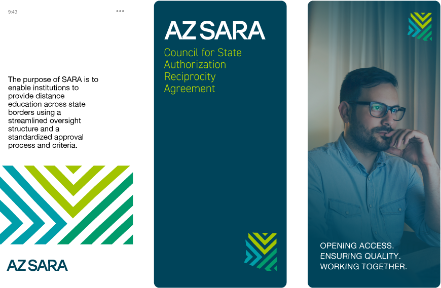
AZ SARA’s brand identity communicates unity, efficiency, and quality assurance in postsecondary education. It reflects a modern, collaborative approach to a complex regulatory landscape.
Design Intent
At the request of AZ SARA’s executive leadership, this brand avoids common state motifs such as flags and typical desert color schemes. Instead, it leans into a more conceptual and future-facing identity.
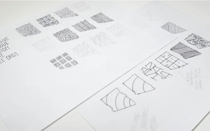
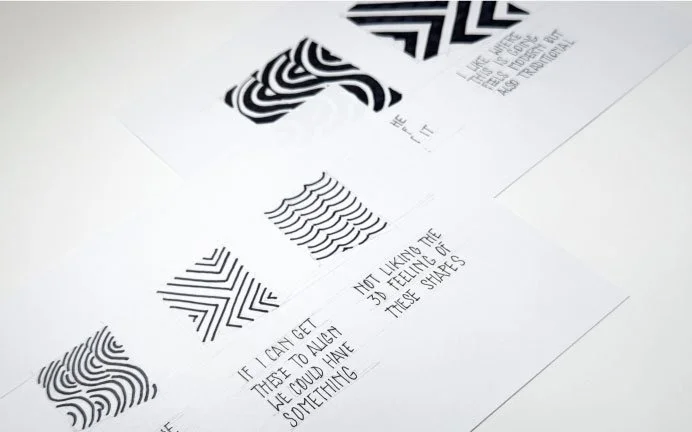
The mark incorporates geometric shapes representing strength and referencing Indigenous visual traditions significant to Arizona. Arrows, or the visual suggestion of arrows, suggest advancement, direction, and the progressive nature of SARA’s mission.
Three different angles of merging lines illustrate the three sectors institutions, states and higher education regional compacts, coming together under one agreement, highlighting collaboration and shared standards

The Brand Mark
The brand mark is the core of AZ SARA’s identity—an instantly recognizable symbol that unifies communications, builds trust, and reflects the organization’s mission. It serves as visual shorthand for collaboration, progress, and quality in education.
Wordmark
The AZ SARA wordmark was designed to complement the geometric logo mark, creating cohesion between symbol and type. Portions of the letterforms were intentionally removed to form negative space, echoing the triangular shapes and directional arrows found in the brand mark. This approach not only integrates the visual language of movement and progress into the typography but also lends the wordmark a contemporary and minimal aesthetic.
Kerning was carefully adjusted so that the letters read as a unified whole while still functioning in two distinct parts, reinforcing balance and clarity. The result is a modern, forward-looking wordmark that seamlessly aligns with the identity’s symbolic foundation.

The typeface foundation of AZ SARA’s wordmark is Stolzl Text Regular. It is highly readable in print and on screen.

Logo Subtext
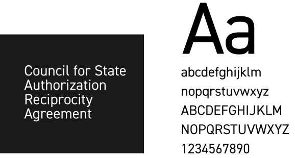
The tagline is set in DIN, a typeface known for its clarity, neutrality, and high legibility. Originally designed for signage and technical applications, DIN conveys authority and accessibility, making it ideal for communicating important information.
Together, the pairing of Stolzl and DIN strikes a balance:
Stolzl provides a progressive and symbolic anchor, visually aligned with the logo mark.
DIN supports it with clarity and straightforwardness, ensuring the tagline is both readable and professional.
This combination reinforces the brand’s dual personality: modern and progressive in vision, yet structured and dependable in practice..
