ART DIRECTION | GRAPHIC DESIGN | BRAND IDENTITY
Echo Festival is a bold, three-day music and arts event set on the San Francisco coastline. The project called for a fresh visual identity that captured the energy of sound, the rhythm of waves, and the spirit of community.
Echo Festival is a celebration of music, art, food, and connection — where echoes of sound meet the waves of the sea.
Echo Music Festival:
Creative Boom Brief
Graphic Designer
Role
Music & Arts / Entertainment
Industry
Create a festival identity that feels modern, energetic, and adaptable — translating echoes and waves into a striking visual system across posters, merch, and digital platforms.
Challenge
I began by exploring the dual concepts of echoes and waves — soundwaves reverberating outward and water ripples expanding across the sea. I sketched and refined a system of concentric shapes that visually merge these two ideas. From there, I chose a bold red-and-white palette to amplify urgency, energy, and visibility, supported by clean, modern typography.
Process
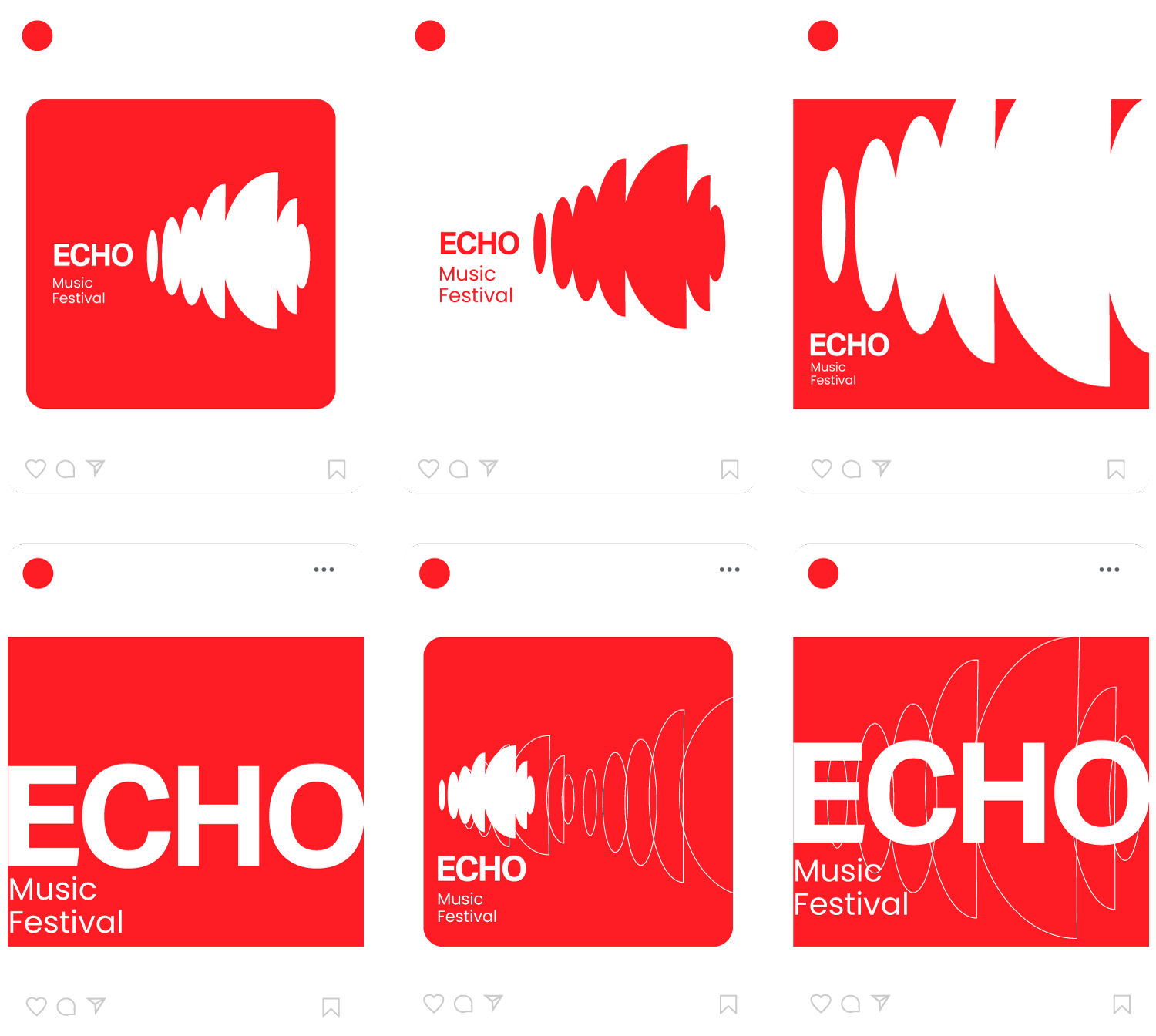
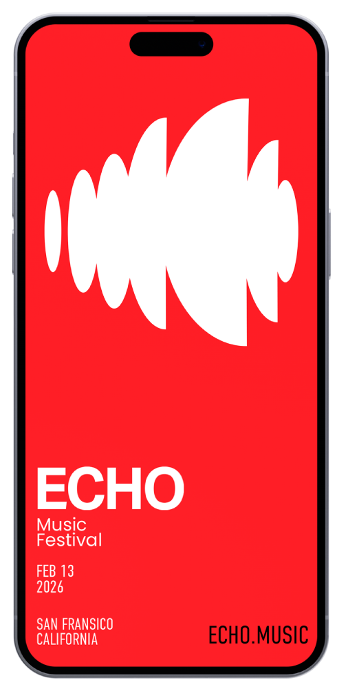
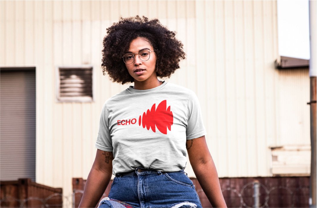
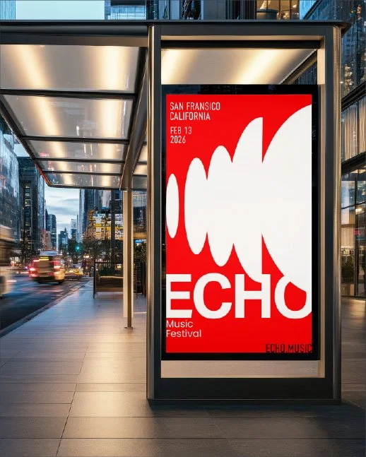
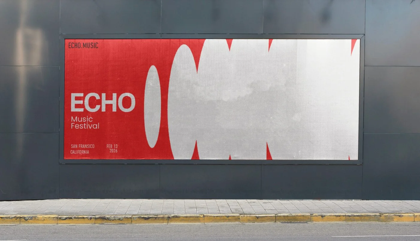
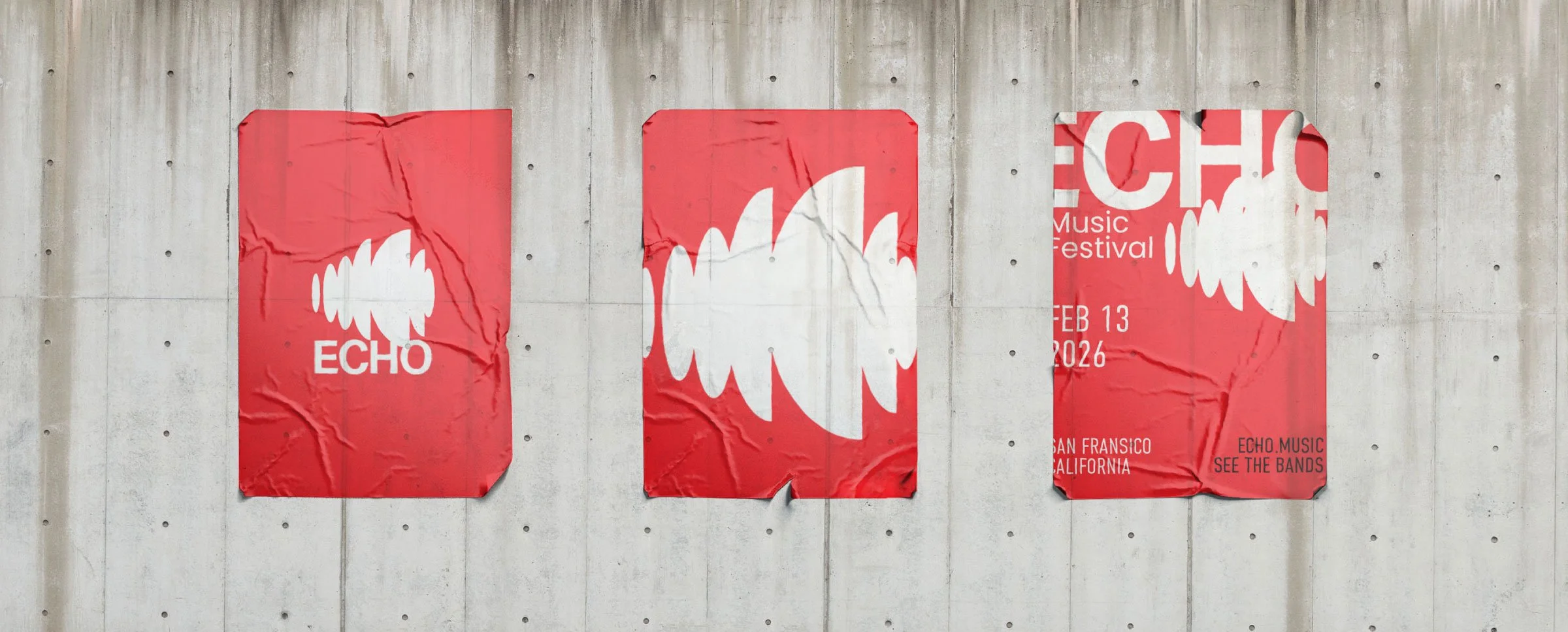
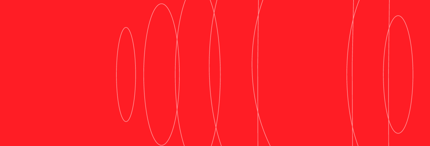
The final identity features a geometric echo-wave logo mark paired with a confident wordmark. The strong red backdrop creates instant recognition, while the waveforms convey the resonance of music and the movement of the sea.
The system translates effortlessly across collateral:
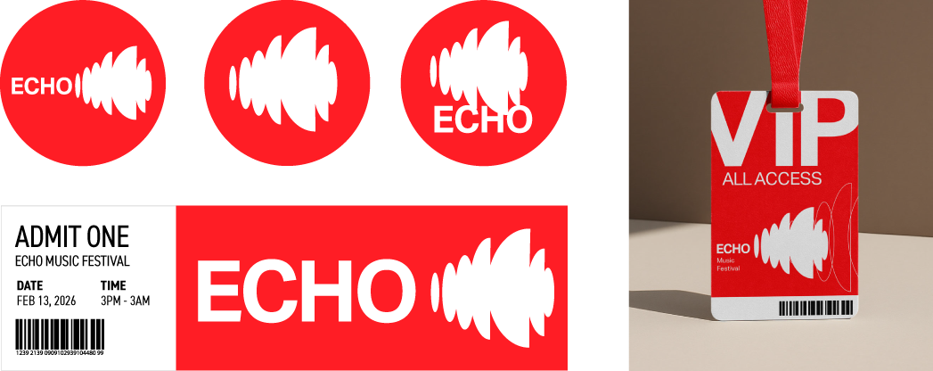
Posters & Tickets – Oversized waveforms, bold typography, and minimal layouts.
Merch & Wristbands – High-contrast red/white applications with short, punchy slogans.
Stage & Signage – Large-scale echoes and directional clarity.
Digital Campaigns – Scroll-stopping visuals optimized for social feeds
Solution
The Echo Festival identity is bold, modern, and highly adaptable. It creates an emotional and visual connection between sound, movement, and place — ensuring Echo Festival resonates with audiences and sets a strong foundation for future growth.
Outcome


Design Process
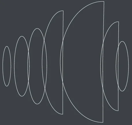
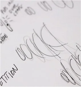
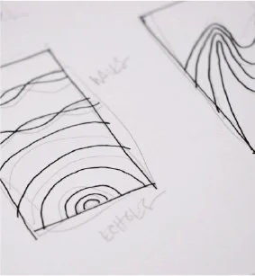
Before moving to digital, I explored a wide range of rough sketches to capture the concept of echoes and waves. I experimented with circular forms, ripple effects, and overlapping shapes to find a balance between sound energy and coastal movement.
These early marks played with:
Repetition of forms to suggest soundwaves expanding outward.
Variations in scale to mimic both rhythm and tidal movement.
Geometric simplification to keep the idea bold and adaptable.
By sketching quickly and broadly, I was able to test how the idea of “echo” could live as a minimal, striking symbol that would stand out in both large-scale (stage signage) and small-scale (wristbands, tickets) applications.
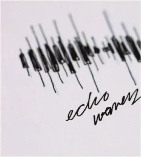
The final logo mark evolved directly from these explorations, distilling the sketches into a clean, geometric system that merges sound, movement, and identity.


Brand Elements
The logo, built on repeating waveforms, embodies both echoes of sound and ripples of water, creating a dynamic bridge between music and the sea. The bold red-and-white palette amplifies urgency, energy, and passion — setting Echo apart as a fresh, modern festival brand.
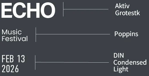
Typography
Color
ENERGY RED
HEX #FF1D25
RGB 255, 29, 37
CMYK 0, 96, 90, 0
WHITE
HEX #FFFFFF
RGB 255, 255, 255
CMYK 0, 0, 0, 0

SLATE GRAY
HEX #3b4147
RGB 59, 65, 71
CMYK 73, 62, 55, 43

Marks